![]() Completely human-written.
Completely human-written.
I work on a macOS app called ![]() Forma with special attention to detail and design of the experience. I feel like this is especially important in an age, when everyone can vibe-code almost anything they can imagine.
Forma with special attention to detail and design of the experience. I feel like this is especially important in an age, when everyone can vibe-code almost anything they can imagine.
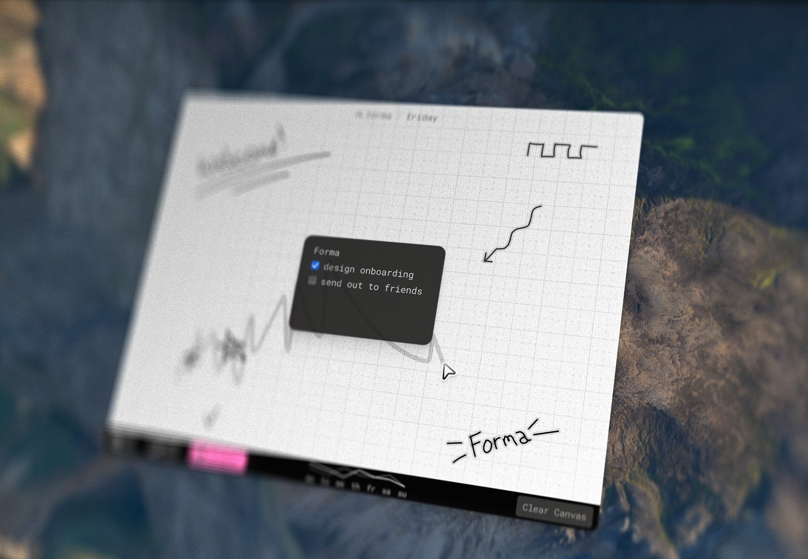
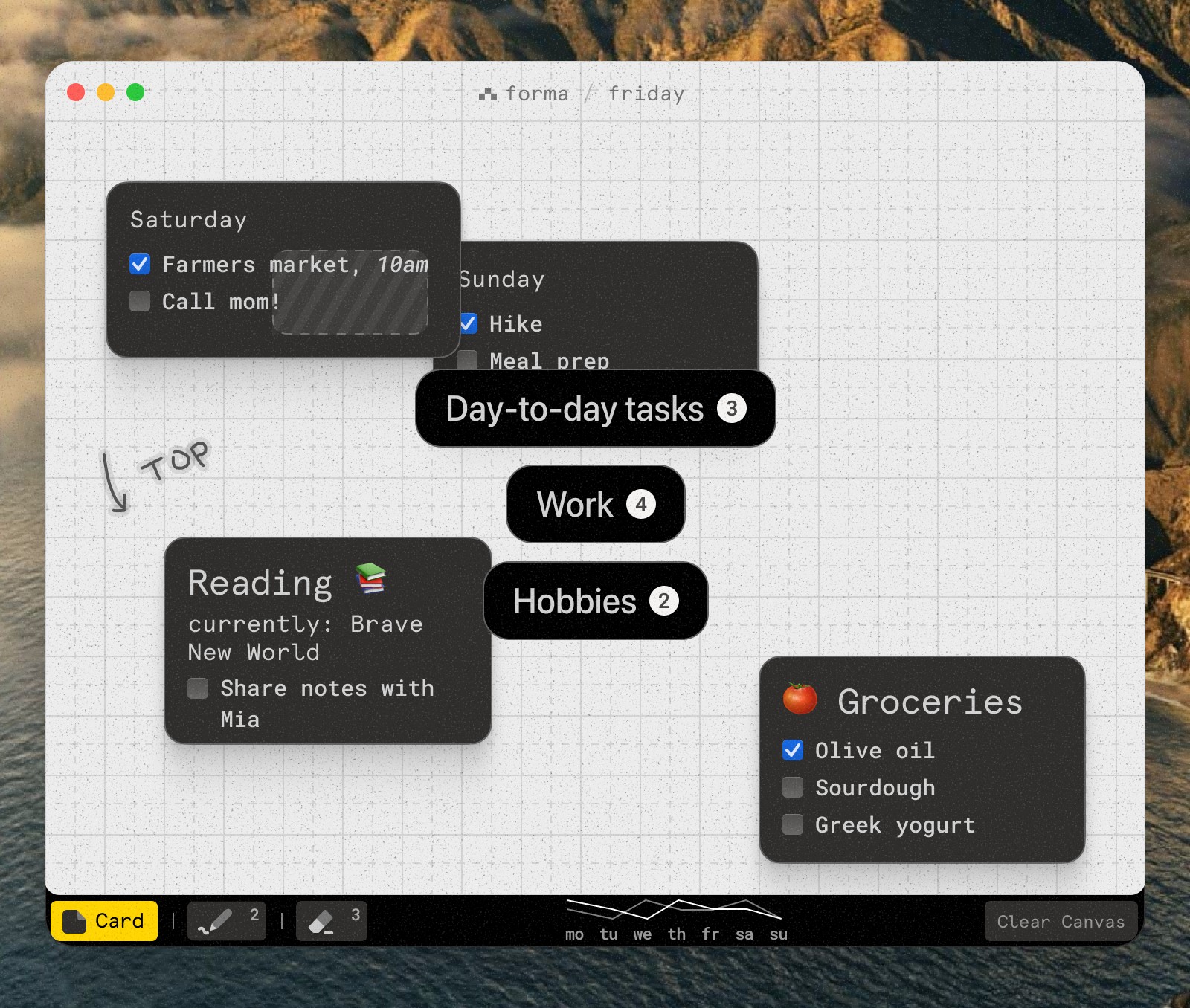
Forma is a canvas for your ideas, tasks, notes or complete project management. You can create cards of any size and place them anywhere on the canvas which allows for all kinds of visual grouping, prioritization and showing connections. Unlike other canvas-based apps Forma's canvas is not infinite, it's the exact size of the window. I treat it like a piece of paper – you have a set amount of space which allows for more creative use of it, in my opinion.
When working on Forma I heavily utilize AI coding agents, which brings us to the reason I wrote this piece – in my opinion not everyone is creating something when they vibe-code. In this article I'll try to explain what I mean and how I try to do it differently when working on Forma.
Guiding principles
To create something cohesive, something that feels real and crafted (oh, we'll get to that word) you must understand what your guiding principles are. Notice I said 'understand', not 'come up with' – that's intentional, because I believe when you're creating something you already have them in the back of your mind. If you're just vibe-coding on the other hand…
Forma guiding principles are: ![]() simplicity,
simplicity, ![]() intentionality &
intentionality & ![]() polish.
polish.
![]() Simplicity is there to make sure things don't get overcomplicated. Even for such a small product I get tons of feature requests that would make the app feel bloated. Whenever anything's decided to be added it should not drastically change the way the app looks and feels, it should be there for the function of it but also become invisible when it's not needed.
Simplicity is there to make sure things don't get overcomplicated. Even for such a small product I get tons of feature requests that would make the app feel bloated. Whenever anything's decided to be added it should not drastically change the way the app looks and feels, it should be there for the function of it but also become invisible when it's not needed.
![]() Intentionality comes hand in hand with simplicity. It's impossible to grow and scale without adding anything new. So whenever a new button gets added I think twice, 3 or even 10 times how, when and where it should appear, if it even should. This might sound very trivial but think how many times in your experience you've heard the problem and immediately jumped to the first logical solution that popped in your head, or even worse – let AI decide for you.
Intentionality comes hand in hand with simplicity. It's impossible to grow and scale without adding anything new. So whenever a new button gets added I think twice, 3 or even 10 times how, when and where it should appear, if it even should. This might sound very trivial but think how many times in your experience you've heard the problem and immediately jumped to the first logical solution that popped in your head, or even worse – let AI decide for you.
![]() Polish comes third because there's no limit to how perfect something can be. I've had this problem at the start of my career where I'd do a good enough solution and jump to something else. I'm battling that still.
Polish comes third because there's no limit to how perfect something can be. I've had this problem at the start of my career where I'd do a good enough solution and jump to something else. I'm battling that still.
I've seen people way smarter than me talking about guiding principles like Josh Puckett in his Interface Craft and Benji Taylor in his Family Values. So if you think this sounds silly and is 'article-talk' – please try it.
Multi Boards
One of the most frequent feedback points I got was 'I need more space'. Since we already know making canvas infinite was against my initial design concept I started thinking about other solutions.
We live in AI era and I assume a lot of people's first instinct would be to go to your AI coding agent of choice and say:
users are saying that they need more space. lets cpme up with a way to help them achieve this
But in my opinion this is the exact pitfall of vibe-coding. When your AI agent starts making decisions instead of you, you're no longer creating something.
So let's go back to the drawing board. What are some possible solutions to this problem?
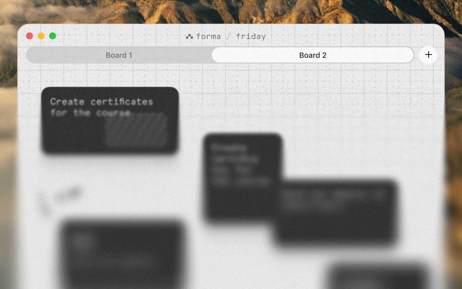
Here's something that probably comes to mind first: tabs. People are familiar with them but in my opinion they don't fit the aesthetic of the app and mess with the ![]() simplicity guiding principle: they're not needed most of the time but take up space in the app window.
simplicity guiding principle: they're not needed most of the time but take up space in the app window.
Or we could experiment with a 'one board per day' concept. It solves the initial problem of not having enough space but indirectly, which I fear is not enough.
Having said that, these approaches are quite obvious and would probably exist in a similar app. Let's move away from the existing UI of the app and think more conceptually: how do we reinvent this while not making it obnoxious to use?

 Interactive
This quick & dirty prototype allows me to feel if this is even the right direction but the solution needs lots of work still. Scrolling between boards feels smooth and fidgety. It goes with my ![]() simplicity guiding principle because when you use the app there's no new buttons, menus or icons – it's only there when you need it and then hides away again.
The base is there, now to the
simplicity guiding principle because when you use the app there's no new buttons, menus or icons – it's only there when you need it and then hides away again.
The base is there, now to the ![]() polish. First, let's bring it in line with the actual UI of the app.
polish. First, let's bring it in line with the actual UI of the app.
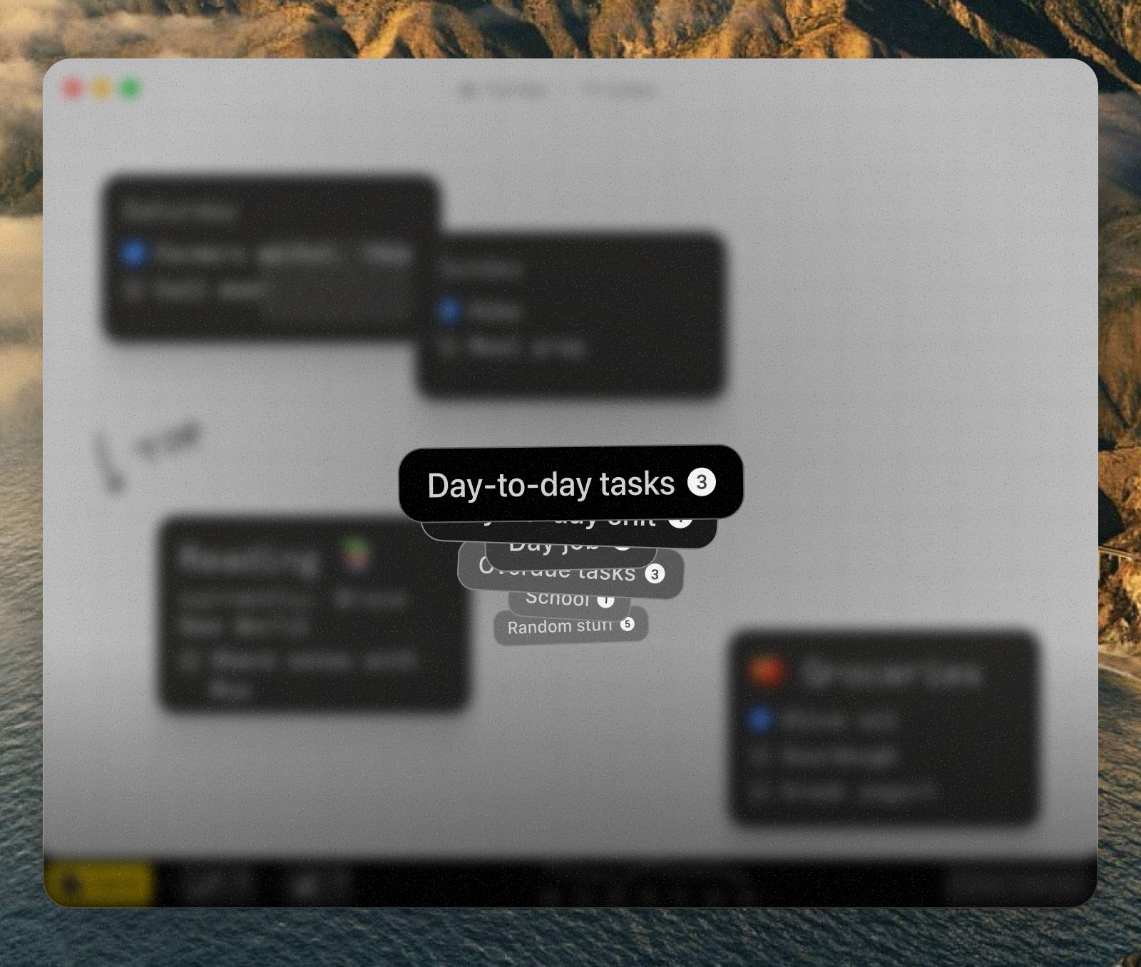
Let's work with the background and make sure we have enough contrast and focus on the actual boards, instead of content behind them by doing this:
- blur the background 10px so the focus is on the board names
- add radial background gradient that goes from 40% opacity at the center to 20%, meaning it's darkest right behind the board names
- additionally, let's add a black gradient at the bottom 3rd that goes from 50% to 25% for a future thing
Here's how that looks:
Now I want to focus on the board name cards. Right now they're all the same size and the top one is not as in focus as I would like it to be. A couple of changes here:
- scale down each next card 1 → 0.9 to give it dimensionality and highlight the top card better
- make background lighter for each next card to show them fading out. It's important to use solid backgrounds here instead of transparency because in the latter one you'd start seeing cards behind it
- rotate randomly -2° to +2° to make it look like a stack of cards unevenly placed on a surface
These tweaks give us this result:
Let's now turn to interaction and actual experience of using this. A couple of things I want to make sure are right:
- each mouse wheel 'click' must scroll through exactly one board
- a switch timer, so you understand exactly how much time you have
Which transforms the app like so:
 Interactive


And as a finishing touch, remember we've added that gradient at the bottom before? It's for a stats row that will show a quick overview of each board while it's active: when was it created, how many cards you had there for all time and also when it was last edited. Here's how a polished version of this feature looks in my world:
Interactive I tried to go through the main points but there's about a million other details that all contribute to making this feel smooth and fidgety, both in visual and interaction design, like haptic feedback for when you scroll boards with a touch pad.
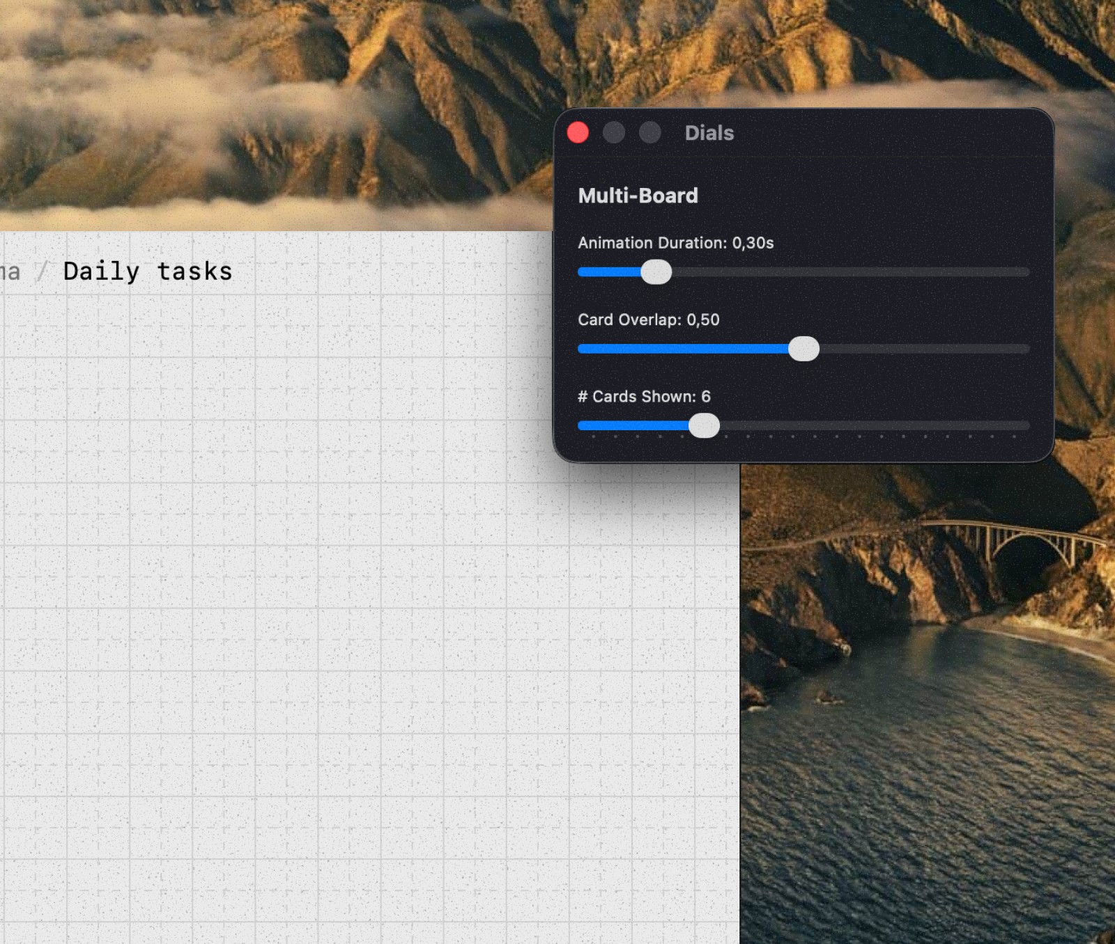
Quick tip: I heavily use sliders & dials when working on something visual or interaction-heavy to make sure I get it just right. This means I get a UI to control all kinds of properties of a feature, like animation speed, overlap %, rotation degree etc. This also saves on tokens!
Craft lives on all layers, not only when working on 'big features'
The word 'craft' is slowly becoming the new buzz-word between people who create digital products. For me craft is unusual attention to detail that 1 in 10 people will notice. Why do it then? Well if you work hard enough on details each of these 10 people will notice their own delight and hopefully form a positive opinion about your product, granted if everything else works as expected (speed, reliability, etc.)
I want to share some delights I did for Forma and inspire you to go beyond what AI agents might default to.
Note: Forma is a native macOS app written in Swift and SwiftUI, meaning all the interactive demos on this page are faithful recreations.
Hidden card
Because Forma is a spatial canvas, only user controls where they place their cards. It is inevitable that one card will get lost behind a second one. That's why in Forma when a card is completely covering a different card you'll still see a faint outline of it.
While this serves the purpose of showing you that there's something behind it, I found it also organically supports ordering: card that is on top needs to be completed first and only after that the second task or note is revealed to you.
Resizing a card
Vibe-coding an app you might write a prompt:
i want to be avle to resize the card by clicking & draging on the edges
And your AI agent will most likely spit out perfectly working code that will allow you to do exactly what you asked for. Here, try it:
 Interactive
 It works but notice anything off? You have to fight the UI, you need to find the exact edge of the card for the cursor to change, signifying that you can, in fact, resize this card now.
Now let's stop asking AI to solve the problem and instead think ourselves.
Create a 20px invisible resize zone around the perimeter of the card. Resize zone must be positioned in such a way that the edge of the card splits this zone in half.
So when we ask it to implement a solution we came up with, we get this:
 Interactive
 Resize me by pulling any side
This is invisible (well not here, I clearly made it red for you) but makes all the difference in day-to-day use.
Card padding
Another detail that might not be obvious right away is that a single padding size doesn't work for all card sizes. One size fits all just doesn't work here. Try for yourself with a slider below.
When bigger cards start looking okay you immediately notice that small cards now have too much space. It's quite obvious – bigger cards need more air to breathe while smaller cards can't have a significant portion of their size be just empty space. Padding can't be fixed, it's variable.
Tooltips
Craft can vary, be it a delightful UX detail that makes using the product feel amazing or just a visual snack, like these tooltips:
 Interactive
 It has been done before a million times. I'm proud to do it for the 1,000,001th time. This just has to become the standard because the alternative is plain bad.
I think there's also something to be said about 'originality'. You don't have to invent new delights or details that have never been done before. People that use your product will not evaluate you on that.
Moving the card
I think at this point it's clear that cards are the most important part of the app so let's look at another example. Since you can create a card of any size anywhere I think it's also safe to say that it's expected that you can pick up and move those cards, almost like stickies on a whiteboard.
i want to be able to move a card bluh bluh you get it
As you already picked up (pun intended), this will most likely work. You will be able to pick up a card and move it to a different place. Will it feel smooth? It will feel like nothing.
Let's give it some love by doing this when a card is picked up:
- scale it up 1 → 1.15 to create an effect of actually picking it up
- increase the shadow opacity 0.08 → 0.12 because the card is now 'higher'
- rotate it by a random degree amount from -2° to +2° because you can't pick something up perfectly upright
Layer some animation to connect all that together and this is what you get:
 Interactive
 Cancel erase
To remove a card you need to swipe through it with the eraser tool, almost like you're crossing it out – and it magically disappears. But sometimes, in the middle of this action you realize that you no longer want to remove this card.
A very similar concept for me is when you try to click on a link but then realize you actually don't want to open it. What you can do in that case is keep your mouse button pressed but move the cursor out of the way and release there cancelling the action.
I took a similar approach but kind of inverted. For a card to be removed your eraser stroke must begin outside of the card, go through it, and finish outside again. But if you're having second thoughts, just bring the stroke back inside the card and it won't be removed. Here, try it:
 Interactive
 This might feel like a complicated interaction but this is the natural thing to try because similar patterns exist.
Adaptive marker
The last thing I want to mention is the marker tool. Canvas is light so marker is black, easy? No, because cards are black as well and I want to have this marker layer on top of everything, allowing people to draw both on canvas but also on cards.
Solution here is trivial: blend mode. Making marker white by default and setting its blend mode to Difference allows to achieve the desired effect. Lines appear black on light backgrounds and white on dark backgrounds.
 Interactive
 Summary
In summary I think blindly vibe-coding does not equal creating. People often rely on AI not to implement their own solutions but rather to solve for them, and thus aren't actually creating anything.
Having said all that don't get the impression that I'm anti-AI. It's a fantastic tool I used to create this very article page along with all the interactive prototypes in it.
If there's one thing I want you to take from this article it's that an AI coding agent should be a continuation of your hands, not your brain, because if it is, why does it need you?
This article has been inspired by two great write ups: World's Most Satisfying Checkbox by Andy Allen and Family Values by Benji Taylor. If you found this article interesting make sure to read those two as well.